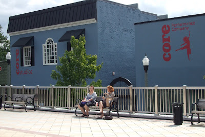
Here's the updated look at the studios and offices with our new pretty signs painted by Michelle Black of acoloraffair.com (designed by our graphic designer, Jon Scott Weaver.)
Here's the back parking lot and the silhouette of Claire jumping that looks great from up when you turn into the alleyway/entrance to the parking lot.
Here's that same one a little closer up:
The front of the studios and offices with their new signs. I had no idea how much went into getting a sign permit, let me tell you, but we worked it out and here they are!
Another silhouette on the front of the office. It had to be 8 ft. square by the regs, so she couldn't be huge and fill up the whole front.
The front of the studios is a little more understated without a dancer on them, but it still looks good!
Sign showing where to go from the back parking lot--no longer faded and no more old logo!
Back door to the offices. Should help with the "where am I going" factor, don't you think? Now I just have to price the equivalent size stickers to go on the glass of the studio door. It may be too expensive in this size, so we'll see what we can do.


No comments:
Post a Comment